无为清净楼资源网 Design By www.qnjia.com
我们用Illustrator绘制飘逸的丝带,教程的步骤写的非常清楚,英文我就不给大家翻译了,感觉大家应该能看懂吧!!如果又看不懂的童鞋存在,本站还有中文版本的,具体链接:https://www.jb51.net/Illustrator/95501.html。站长和大家顺便一起学习下英文吧!都快忘光了!呵呵 Step 1 - draw the first part of the ribbon
A basic knowledge on how to use the pen tool and how to draw bezier curves is needed to get started with this tutorial.

Draw a curved line that looks similar to the illustration above. Hold down the shift key while dragging the handles in the last point of the curved line. Drag a vertical guide onto the curved line as shown in the picture above. To make it snap to the exact position, make sure that Smart Guides is checked (View > Smart Guides or command/control + U). Step 2 - break the curve into 2 parts
Because we'll have to apply different shades and we need to create depth into the ribbon, we need to cut the ribbon into different segments.

Select the Scissors Tool and click on the location on the path as shown in the picture above. With the Smart Guides active you'll get the 'intersect' text when your cursor is at the right spot. Now the path is cut into 2 segments. Select both segments, hold down the shift + option/alt key and drag/copy the paths vertically as shown in the picture above. Step 3 - close the paths
Close the paths as shown in the picture below, so the ribbon exists of 2 segments. Select both segments, select the Rotate Tool and click while holding down the alt/option on the location as shown below in the picture, enter 180° and click the Copy button.
 Step 4 - rotate and duplicate the 2 segments of the ribbon
Advanced users will probably just click on the exact location, hold down the alt/option and shift key while dragging the segment to the correct location as show in the picture below.

Chances are that both segments don't perfectly match. Select the 2 new segments, zoom in, and drag them to the exact location. With Smart Guides still checked it'll snap and you'll see the word 'origin' appearing. Step 5 - merge the middle segments of the ribbon into 1 segment
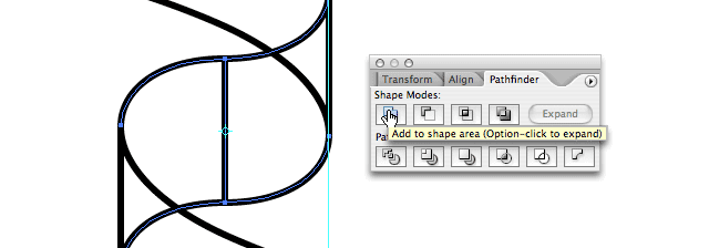
Select the 2 middle segments of the ribbon and click on the "Add to shape" option in the Pathfinder palette. This way Illustrator will treat these parts of the ribbon as 1 object which will make it easier when we give this segment a fill.
 Step 6 - giving the ribbon segments a gradient fill
Our ribbon is now divided into 3 segments. All we need to do now is give each segment its own fill. To add dimension and depth we need to use a different (linear) gradient on each segment:

First segment gradient consists of : 50% cyan and 7% magenta, 32% cyan and 4% magenta, then again 50% cyan and 7% magenta followed by 69% cyan and 10% magenta.
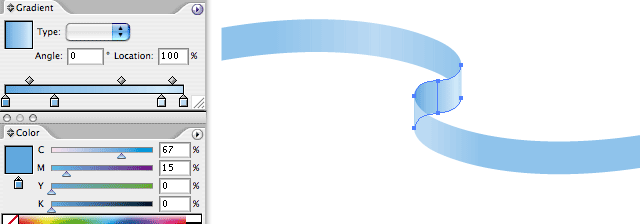
Second segment gradient consists of the following swatches : 67% cyan and 15% magenta, 50% cyan and 7% magenta, then 23% cyan followed by 31% cyan and 5% magenta.

Last segment gradient consists of : 50% cyan and 7% magenta, then again 50% cyan and 7% magenta followed by 31% cyan and 5% magenta.
You probably have to use 'Send to back' or 'Bring to front' on the different segments to get them into the correct perspective. Step 7 - fine tuning the centered curve of the ribbon
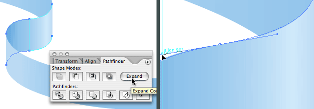
As you probably have notice, the curve in the center doesn't look that natural. That's because I drew that part holding down the shift key, but this was needed to make sure the rotated ribbon would match perfectly on the original one. I can correct this very easily, but first I need to expand the 2 merged segments. Select both segments and click 'Expand' in the Pathfinder palette. This way the vertical line connecting the 2 segments disappear and we have only 2 bezier points left. Now it's a matter of dragging the handles into the preferred position to smooth the curve of the ribbon.
Ah! Much better don't you think? :)

You can make the ribbon larger by copying the entire ribbon and paste it next to the ribbon. You can also merge the middle segment that connects the 2 ribbons. Then you can select the entire ribbon and use the Free Distort Filter to achieve extra depth. Last but not least you can rotate the ribbon. That's what I did in my illustration.
A basic knowledge on how to use the pen tool and how to draw bezier curves is needed to get started with this tutorial.

Draw a curved line that looks similar to the illustration above. Hold down the shift key while dragging the handles in the last point of the curved line. Drag a vertical guide onto the curved line as shown in the picture above. To make it snap to the exact position, make sure that Smart Guides is checked (View > Smart Guides or command/control + U). Step 2 - break the curve into 2 parts
Because we'll have to apply different shades and we need to create depth into the ribbon, we need to cut the ribbon into different segments.

Select the Scissors Tool and click on the location on the path as shown in the picture above. With the Smart Guides active you'll get the 'intersect' text when your cursor is at the right spot. Now the path is cut into 2 segments. Select both segments, hold down the shift + option/alt key and drag/copy the paths vertically as shown in the picture above. Step 3 - close the paths
Close the paths as shown in the picture below, so the ribbon exists of 2 segments. Select both segments, select the Rotate Tool and click while holding down the alt/option on the location as shown below in the picture, enter 180° and click the Copy button.
 Step 4 - rotate and duplicate the 2 segments of the ribbon
 Advanced users will probably just click on the exact location, hold down the alt/option and shift key while dragging the segment to the correct location as show in the picture below.

Chances are that both segments don't perfectly match. Select the 2 new segments, zoom in, and drag them to the exact location. With Smart Guides still checked it'll snap and you'll see the word 'origin' appearing. Step 5 - merge the middle segments of the ribbon into 1 segment
Select the 2 middle segments of the ribbon and click on the "Add to shape" option in the Pathfinder palette. This way Illustrator will treat these parts of the ribbon as 1 object which will make it easier when we give this segment a fill.
 Step 6 - giving the ribbon segments a gradient fill
 Our ribbon is now divided into 3 segments. All we need to do now is give each segment its own fill. To add dimension and depth we need to use a different (linear) gradient on each segment:

First segment gradient consists of : 50% cyan and 7% magenta, 32% cyan and 4% magenta, then again 50% cyan and 7% magenta followed by 69% cyan and 10% magenta.

Second segment gradient consists of the following swatches : 67% cyan and 15% magenta, 50% cyan and 7% magenta, then 23% cyan followed by 31% cyan and 5% magenta.

Last segment gradient consists of : 50% cyan and 7% magenta, then again 50% cyan and 7% magenta followed by 31% cyan and 5% magenta.
You probably have to use 'Send to back' or 'Bring to front' on the different segments to get them into the correct perspective. Step 7 - fine tuning the centered curve of the ribbon
As you probably have notice, the curve in the center doesn't look that natural. That's because I drew that part holding down the shift key, but this was needed to make sure the rotated ribbon would match perfectly on the original one. I can correct this very easily, but first I need to expand the 2 merged segments. Select both segments and click 'Expand' in the Pathfinder palette. This way the vertical line connecting the 2 segments disappear and we have only 2 bezier points left. Now it's a matter of dragging the handles into the preferred position to smooth the curve of the ribbon.

Ah! Much better don't you think? :)

You can make the ribbon larger by copying the entire ribbon and paste it next to the ribbon. You can also merge the middle segment that connects the 2 ribbons. Then you can select the entire ribbon and use the Free Distort Filter to achieve extra depth. Last but not least you can rotate the ribbon. That's what I did in my illustration.
无为清净楼资源网 Design By www.qnjia.com
广告合作:本站广告合作请联系QQ:858582 申请时备注:广告合作(否则不回)
免责声明:本站文章均来自网站采集或用户投稿,网站不提供任何软件下载或自行开发的软件! 如有用户或公司发现本站内容信息存在侵权行为,请邮件告知! 858582#qq.com
免责声明:本站文章均来自网站采集或用户投稿,网站不提供任何软件下载或自行开发的软件! 如有用户或公司发现本站内容信息存在侵权行为,请邮件告知! 858582#qq.com
无为清净楼资源网 Design By www.qnjia.com
暂无评论...
RTX 5090要首发 性能要翻倍!三星展示GDDR7显存
三星在GTC上展示了专为下一代游戏GPU设计的GDDR7内存。
首次推出的GDDR7内存模块密度为16GB,每个模块容量为2GB。其速度预设为32 Gbps(PAM3),但也可以降至28 Gbps,以提高产量和初始阶段的整体性能和成本效益。
据三星表示,GDDR7内存的能效将提高20%,同时工作电压仅为1.1V,低于标准的1.2V。通过采用更新的封装材料和优化的电路设计,使得在高速运行时的发热量降低,GDDR7的热阻比GDDR6降低了70%。
更新日志
2024年11月16日
2024年11月16日
- 2019明达发烧碟MasterSuperiorAudiophile[WAV+CUE]
- 蔡幸娟.1993-相爱容易相处难【飞碟】【WAV+CUE】
- 陆虎.2024-是否愿意成为我的全世界【Hikoon】【FLAC分轨】
- 关淑怡.2009-ERA【星娱乐】【WAV+CUE】
- 林忆莲《关于她的爱情故事》2022新世纪MQA 24K金碟限量版[WAV+CUE]
- 张雨生1993《一天到晚游泳的鱼》台湾G字首版[WAV+CUE][1G]
- 群星《试音五大女声》[WAV+CUE][1G]
- 魔兽世界wlk武器战一键输出宏是什么 wlk武器战一键输出宏介绍
- 魔兽世界wlk狂暴战一键输出宏是什么 wlk狂暴战一键输出宏介绍
- 魔兽世界wlk恶魔术士一键输出宏是什么 wlk恶魔术士一键输出宏介绍
- 医学爱好者狂喜:UP主把医学史做成了格斗游戏!
- PS5 Pro评分解禁!准备升级入手吗?
- 我们盘点了近期火热的国产单机游戏!《琉隐神渡》等 你期待哪款?
- 2019年第12届广州影音展双碟纪念版ADMS2CD[MP3/WAV]
- 黄安《救姻缘》台首版[WAV+CUE]
